FINALLY, A SPACE TO CELEBRATE AND SHOWCASE THE BEST OF FILIPINO TYPOGRAPHY ONLINE
Calling all artists out there who are constantly in the search for new type designs to use and be inspired by, but never seem to find ones created by fellow Filipino creatives. This is Type 63.
Recently, the importance of visually-appealing fonts is getting more and more realized by designers, artists, and businesses alike. How a piece of text looks, is now just as important as what the text actually conveys, and the rest of the design’s big picture. This growing demand for well-designed typography encouraged designer Jo Malinis to launch Type63.
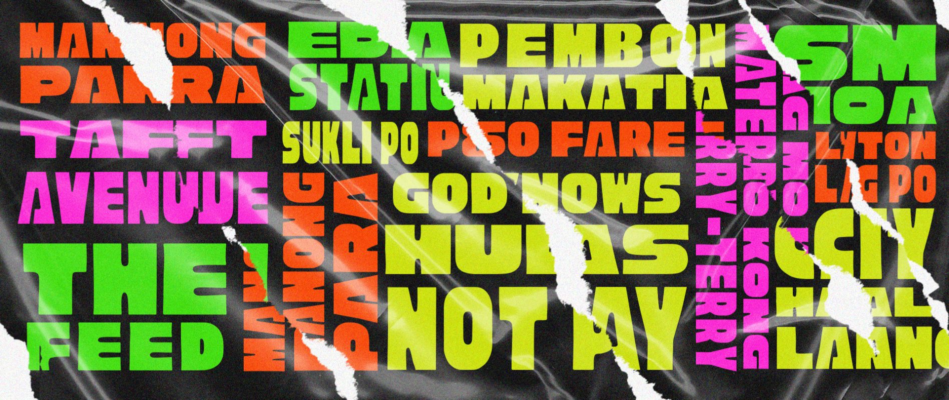
Assembled on Instagram and Facebook, Type63 is an account dedicated to showcasing stunning type designs and typography by Filipino designers alone, moved by the lack of platforms focused on solely local designs. Since its launch over a month ago, the collection is now close to a hundred submissions of different type designs — ranging from styles inspired by jeepney signages, traditional writing systems, and other visually-striking concepts from everyday Filipino culture.
The page holds some of the most impressive and diverse type designs by local artists throughout the years, with several submissions used for client work, festival branding, and even personal projects. A few notable works that were featured in major campaigns are Nilad for the Escolta Block Festival by designer Vince Africa, the iconic Archipelago type by And A Half Studios, and the custom typeface created by designer CMYKa for the 2019 Cebu Zine Fest poster.
The initiative is a fun and much-needed avenue to show off the country’s creativity and talent in calligraphy. On top of compiling the best of Pinoy-centric typography, it’s also a great way to encourage and motivate type designers who work tirelessly for these projects, and almost never get the recognition they deserve.
Type63 also pushes its commitment to the typography community further by introducing Type Talks Tuesday, a conversation with creatives about all things design. Its first guest, Aaron Amar, created some of the most popular works on the page — Cubao Free, Quiapo Free, and Matatas One — and shared his type journey, as well as some pieces of advice for aspiring designers. New episodes are scheduled to go live every fourth Tuesday of the month.